
css实现毛玻璃效果
毛玻璃效果
毛玻璃效果有朦胧美,很适合在以图片为底的文字展示。
用PS比较容易实现毛玻璃效果,网上也有很多教程。但是切图的方法总归有些限制,有局限性,不如直接用代码实现灵活。
在百度里搜索,扑面而来的好多都是使用filter: blur()+background-attachment属性 方法实现,个人觉得其实backdrop-filter属性更方便,代码量更少,也很好理解。
实际上,MDN上也是使用backdrop-filter属性实现的毛玻璃效果。
backdrop-filter CSS 属性可以让你为一个元素后面区域添加图形效果(如模糊或颜色偏移)
参考网址——MDN Web Docs
filter方法
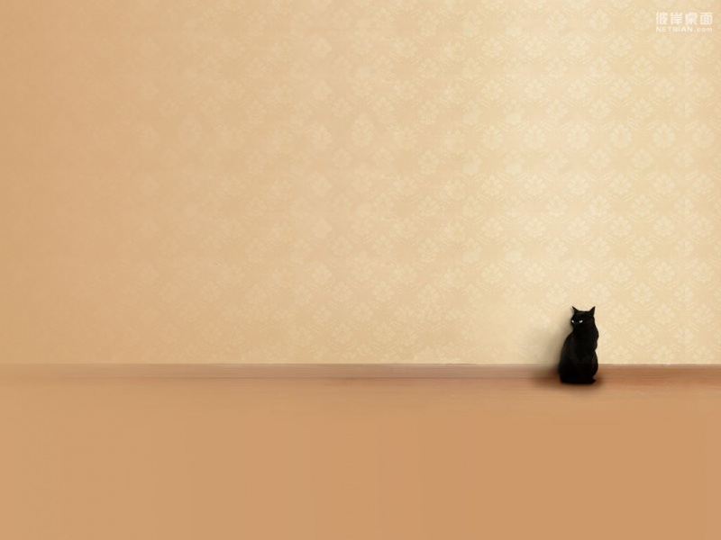
准备——首先给盒子背景图片:
.box{background: url('./img/bg1.jpg');background-repeat: no-repeat;background-size: cover;background-position: center center;/* p居中 */display: flex;align-items: center;justify-content: center;}
之后需要给里面的文字框一个透明背景:
.box p{padding: 80px 60px;border-radius: 12px;background-color: rgba(255,255,255,.2);}
接着实现毛玻璃效果,由于直接给p加上模糊效果会导致上面的文字也会变模糊不清。
所以需要曲线救国,给p标签的伪元素加模糊,但是又会导致看不见后面的图片背景。
所以又需要给伪元素加上背景图片。
.box p{padding: 80px 60px;font-size: 24px;border-radius: 12px;background-color: rgba(255,255,255,.2);position: relative;overflow: hidden;}.box p::before{content: '';// 伪元素大小与父元素一致position: absolute;top: 0;bottom: 0;left: 0;right: 0;background-color: rgba(255,255,255,.5);background: url('./img/bg1.jpg');background-position: center center;background-repeat: no-repeat;background-size: cover;}
之后为了让伪元素位于父元素下方,需要给p标签加上z-index: 1,伪元素加上z-index: -1;
但又会发现伪元素内的图片与后面的图片不一致,有需要给伪元素加上background-attachment: fixed;属性才可。
之后给伪元素加上模糊:
filter: blur(10px);-webkit-filter: blur(10px);
至此,实现模糊效果;你会发现这种方法太复杂,代码量大,考虑的因素多。
所以推荐下面这种方法:
backdrop-filter方法
这种方法是我在浏览MDN官网时发现的,官网上的示例就是backdrop-filte属性实现玻璃效果。-MDN:backdrop-filte
首先,给盒子加个图片,p标签加个透明背景。
.container{width: 400px;height: 400px;background: url('./img/bg1.jpg');background-repeat: no-repeat;background-size: cover;background-position: center center;/* p居中 */display: flex;align-items: center;justify-content: center;}.container p{padding: 40px 30px;font-size: 24px;border-radius: 12px;background-color: rgba(255,255,255,.2);}
之后给p标签加个backdrop-filter: blur(15px);属性即可实现玻璃模糊效果!
加个投影效果会更好:
.container{width: 400px;height: 400px;background: url('./img/bg1.jpg');background-repeat: no-repeat;background-size: cover;background-position: center center;/* p居中 */display: flex;align-items: center;justify-content: center;}.container p{padding: 40px 30px;font-size: 24px;border-radius: 12px;background-color: rgba(255,255,255,.2);backdrop-filter: blur(15px);box-shadow: 0 0 10px #333;}