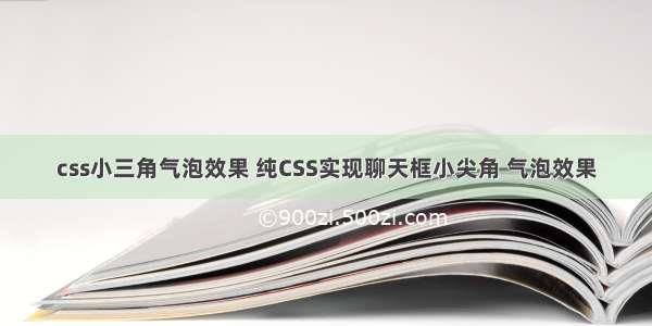
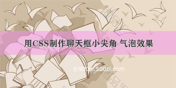
今天给大家分享一个我刚做的项目中的一个小案例, 因为我们在做一个聊天的功能,之前的聊天页面UI很丑,我就不在这里展示给大家了。
现在就教大家怎么用css3制作一个和微信聊天界面一样的页面。
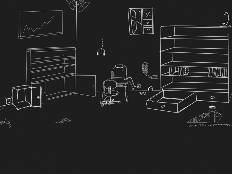
首先给大家看看页面的样子吧,如下图所示:
页面大致就是这个样子,接下来我们来一起学习制作步骤吧。
第一部分: HTML
二货,你看你傻样!
嘻嘻嘻嘻。。。。。。
笑什么笑,没看到本宝宝今天变漂亮了吗?
不不不,每天你都很漂亮的啦!
第二部分: CSS3
PS(这里也算是最重要的部分了我就把全部的代码都展示出来吧!)
/* 微信气泡 */
div.speech {
float: left;
margin: 10px 0;
padding: 8px;
table-layout: fixed;
word-break: break-all;
position: relative;
background: -webkit-gradient( linear, 50% 0%, 50% 100%, from(#ffffff), color-stop(0.1, #ececec), color-stop(0.5, #dbdbdb), color-stop(0.9, #dcdcdc), to(#8c8c8c) );
border: 1px solid #989898;
border-radius: 8px;
}
div.speech:before {
content: '';
position: absolute;
width: 0;
height: 0;
left: 15px;
top: -20px;
border: 10px solid;
border-color: transparent transparent #989898 transparent;
}
div.speech:after {
content: '';
position: absolute;
width: 0;
height: 0;
left: 17px;
top: -16px;
border: 8px solid;
border-color: transparent transparent #ffffff transparent;
}
div.speech.right {
display: inline-block;
box-shadow: -2px 2px 5px #CCC;
margin-right: 10px;
max-width: 75%;
float: right;
background: -webkit-gradient( linear, 50% 0%, 50% 100%, from(#e4ffa7), color-stop(0.1, #bced50), color-stop(0.4, #aed943), color-stop(0.8, #a7d143), to(#99BF40) );
}
div.speech.right:before {
content: '';
position: absolute;
width: 0;
height: 0;
top: 9px;
bottom: auto;
left: auto;
right: -10px;
border-width: 9px 0 9px 10px;
border-color: transparent #989898;
}
div.speech.right:after {
content: '';
position: absolute;
width: 0;
height: 0;
top: 10px;
bottom: auto;
left: auto;
right: -8px;
border-width: 8px 0 8px 9px;
border-color: transparent #bced50;
}
div .left {
display: inline-block;
box-shadow: 2px 2px 2px #CCCCCC;
margin-left: 10px;
max-width: 75%;
position: relative;
background: -webkit-gradient( linear, 50% 0%, 50% 100%, from(#ffffff), color-stop(0.1, #eae8e8), color-stop(0.4, #E3E3E3), color-stop(0.8, #DFDFDF), to(#D9D9D9) );
}
div .left:before {
content: '';
position: absolute;
width: 0;
height: 0;
top: 9px;
bottom: auto;
left: -10px;
border-width: 9px 10px 9px 0;
border-color: transparent #989898;
}
div .left:after {
content: '';
position: absolute;
width: 0;
height: 0;
top: 10px;
bottom: auto;
left: -8px;
border-width: 8px 9px 8px 0;
border-color: transparent #eae8e8;
}
.leftimg {
float: left;
margin-top: 10px;
}
.rightimg {
float: right;
margin-top: 10px;
}
.leftd {
clear: both;
float: left;
margin-left: 10px;
}
.rightd {
clear: both;
float: right;
margin-right: 10px;
}
.leftd_h{
width: 39px;
height: 39px;
border-radius: 100%;
display: block;
float: left;
overflow: hidden;
}
.leftd_h img{
display: block;
width: 100%;
height: auto;
}
.rightd_h{
width: 39px;
height: 39px;
border-radius: 100%;
display: block;
float: right;
overflow: hidden;
}
.rightd_h img{
display: block;
width: 100%;
height: auto;
}
这里基本是上用了CSS伪类元素,来制作的小气泡。网上有很多的案例都是吧用户聊天的头像作为背景图,但是我感觉这样子在实际项目中,并不是很合适,所以我就做了一些修改,然我们更加实用。
以上的代码就是小气泡的全部代码,希望对大家的学习有所帮助,也希望大家多多支持脚本之家.